FitnessSyncer Dashboard
FitnessSyncer Dashboard is a reporting dashboard that allows you to see your health and fitness over time via graphs and charts. Quickly spot trends or anomalies in your exercise routines and stay motivated.
The Dashboard is entirely based on the data which you have in FitnessSyncer, so to get started with the Dashboard, add Data Sources or a FitnessSyncer Notebook entry.
You may filter your data using the filter icon , where you can remove duplicate data or select the sources used in the display. FitnessSyncer Pro users can also choose the types of activities they would like to be shown, such as only showing Runs, Swims, and Cycling trainings.
By default, we show the data in a weekly granularity. You can change this by selecting the graph by icon and you may choose between day, week, or month.
You can control the imperial or metric setting and time zone of the display on the Dashboard on your Profile. Note that if you have saved a copy of the Dashboard, you may need to manually change the data for the charts to reflect your preferences.
You can also share the Dashboard with your family, friends, and colleagues via the share icon . When you select this option, you will be asked if you wish to share the current Dashboard or all Dashboards, and will then have the ability to share the item on Facebook, Twitter, E-mail, or to post a link. You can revoke your sharing on the Sharing section of your Profile.
Users on our free tier can only see the most recent 30-day’s worth of data and cannot customize the dashboard. Learn more about becoming a FitnessSyncer Pro.
Dashboards for FitnessSyncer Pro Users
FitnessSyncer Pro users have the most powerful experience on FitnessSyncer Dashboard. You can customize the dashboard, create unlimited reports, advanced filtering capabilities including by sport and date range, and more!
In addition to the ability to Filter by Activity Type, you also can quickly see different views of your data using presets or be able to customize the date range to zoom into the precise data you are interested in.
FitnessSyncer Pro users can also customize and save an unlimited number of Dashboards with many data visualizations to help you get the most of your data.
FitnessSyncer Report Sampler
FitnessSyncer provides a lot of charts and options for chart configuration. To help you get up and running quickly, we have FitnessSyncer Report Sampler, which shows you all of your data in various charts we’ve already created.
See one you like? Click the Gear and then select the Add To Dashboard option. This will allow you to pick the Dashboard you wish to add it to.
All of the charts on this page are based on your data. For example, if you do not have Blood Pressure data, there will not be blood pressure charts.
Dashboard Customization
To customize the FitnessSyncer Dashboard, select the on the Gear .
When you enter into Edit Mode, you will see a panel at the top of the screen with the current report properties. All of the charts associated with the report (even those without data) will be shown and have a gear menu associated with them.
From the dialog at the top of the screen, you can:
- Change the report name by editing the Report Name
- Create a copy of the report by selecting “Save As” — Note that you cannot save when a Dashboard is still loading.
- Delete the report by selecting “Delete”
- Undo all changes to the report by selecting “Reset”
- Exit edit mode “Cancel”
- Adding new charts to a dashboard by selecting the “New Chart” button.
- Change Report Properties such as colors by using the “Properties” button.
To create a new, blank report, you would do so from the Report Load menu and selecting the icon.
On each of the charts, you can
- Reorder the charts by simply clicking and dragging charts to the location you wish.
- Change the properties of a chart by the Gear near a chart and selecting the Properties option.
- Clone charts by clicking the Gear near a chart and selecting the Clone Chart to clone the report inline or Clone to Dashboard to clone it to another report.
- Remove charts by clicking the Gear near a chart and selecting the Remove option.
- Change the width of certain charts by clicking the Gear near a chart and selecting the Toggle Width option.
- Download the backing data of most charts by clicking the Gear near a chart and selecting the Download CSV option.
Report Settings
You can change the properties by clicking the Properties button from the report edit mode at the top of the screen.
You can change the colors used in most charts on the Color tab.
You can change the report’s default graph by and scope on the Settings tab.
Chart Configuration
Most of the power in the FitnessSyncer Dashboard for Pro users comes in the ability to add your own charts to the dashboard and to edit the current charts to meet your needs. This section discusses the various options available.
There are 4 chart categories which will be discussed below:
- Charts: this includes all chart visualizations ranging from Area, Line, Pie, and more.
- Key Performance Indicators: this includes key performance indicator summaries either in textual or visual form.
- Collections: these are pre-packaged FitnessSyncer options, such as Goal KPI Set, ShoeRenew Lifetime Reports, Personal Detail Tables, and Allergy, Condition, and Medication reports.
- UI Items: these are pre-packed FitnessSyncer UI elements, such as Report Navigation, Source Filters, and Title sections.
Charts
Charts are graphical visualizations of your data.
FitnessSyncer has two types of charts, one of which can only accept one data element per chart. These charts include:
- Pie Chart
- Donut Chart: Like a Pie chart, but with a hole in the middle
- Heat Map Chart: Shows the popularity of data distribution based on a Heat Map configuration.
- Table Charts: Data shown as a table
The other type of chart allows you to have multiple data items shown. These charts include:
- Area Chart: Chart which the region from 0 to the current item is filled in.
- Area Range Chart: Chart shows the average value as a line and the range of the data as an area around the average.
- Bar Chart: Shows the data in bars
- Column Chart: Shows the data in columns
- Histogram Chart: Shows data frequency, such as how many of your runs are 3 miles, 5 miles, etc.
- Item Duration by Day: Similar to the Daily Analyzer, shows your activities and sleep per day by hour and duration.
- Line Chart: Chart with just a line
- Scatter Chart: Scatter Plot shows the relationship between your data based on a Labeler for grouping.
- Spider Chart: Based on categories, spreads data on a spider web.
- Stacked Bar Chart: Bar chart where instead of the categories being side-by-side, they are stacked.
- Stacked Column Chart: Column chart where instead of the categories being side-by-side, they are stacked.
- Variable Pie Chart: Pie chart along two dimensions.
Key Performance Indicators
Key Performance Indicators are summaries of your data into a single numerical value which can help quickly drive action.
To produce the single numerical value, Key Performance Indicators summarize the data first by data period (Daily, Weekly, or Monthly per the Graph By , and then summarizes each of the periods to produce a single end value.
There are three times of Key Performance Visualizations:
- Key Performance Indicator: This is a textual representation of the number, which includes the number, unit, and title.
- Solid Gauge: This is a percentage-based representation of the number, which shows the number on a gauge up to 100%.
- Three Ring Chart: This is a percentage-based representation of up to 3 individual percentages.
For the Key Performance Indicator, blood pressure and body mass index values will be colored based on whether it is considered high or not. You can disable this in the chart’s General settings .
For the Solid Gauge and Three Ring Charts, the numbers should be a percentage to make sense on the chart. Otherwise, the results may not make sense. If you are a user of FitnessSyncer Goals, we will automatically convert Goal-based metrics to a percentage based on the stated goal.
Collections
FitnessSyncer provides two different types of collections.
The first type of collection is the Preconfigured Collections, which you can choose from:
- Goal KPI Set: This is a set of Key Performance Indicators all based on your configured goals and shows you data such as how often you have met your configured goals.
- ShoeRenew Lifetime Solid Gauge Set: This will display a Solid Gauge for each of your configured FitnessSyncer ShoeRenew tasks so you can quickly tell how your shoes or other tracked equipment is doing.
The second type of collection is the Preconfigured Table Collection, which you can choose from:
- Personal Details Table: This table shows you your personal details.
- Allergies: These tables will allow you to show all, current, or past allergies you have had.
- Conditions: These tables will allow you to show all, current, or past conditions you have had.
- Medications: These tables will allow you to show all, current, or past medications you have been on.
UI Items
To help you create very usable Dashboards, we have included a set of UI components.
Report Navigation
Report Navigation allows you to link a few dashboards together and quickly navigate to them by picking one.
When you select this option, the Reports tab will appear when you can drag reports you have previously created from the Reports Available section to the Reports section or to reorder items in the list.
Section Break
Section Break divides sections of reports. It does not include any visual change on the dashboard itself.
Source Filter
Source Filter allows you to quickly filter based on a particular source based on its name. For example, if you name your Activity and Sleep feeds the same name for Fitbit, you can quickly filter the report to just the data from Fitbit using this option.
Title
The Title item allows you to put in labels within the reports. In the General Tab you can enter in a Title, Subtitle, and for select accounts, Images.
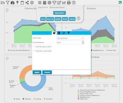
Chart
The Chart tab is where one selects the chart type (as described above) and options for that chart. Options are based on the chart type itself and include:
- Number Format Styling, such as whether to show the decimal or not or whether the results are time-based.
- Labeler: Some charts require the data to be labeled to make sense on the chart.
- Scatter Type: Type of scatter Algorithm.
- Reducer per Period
- Reducer for the Final Result for Key Performance Indicators
- Heat Map Type
- Table Sorting and Grouping
- Table option for creating a Goal-based table.
- Table option for adding the total row (if more than 1 row present)
- Data Order Reversal for Charts like Column Charts
- Granularity for the data, including by Minute and Hour if your data sources permit.
- How do you wish to treat No Data? You can either treat it as not present (default) or 0.
- How do you wish to treat zero? You can either treat it as 0 (default) or not present.
Labelers include:
- Source of the Data (Default)
- Time of Day
- Relative Time of Day (such as Morning, Noon, Evening)
- Meal (such as Breakfast, Lunch, Dinner)
- Activity Name
- Data Unit
- Glucose Context
- Static values, such as Calories
Data
The Data tab is shown whenever data is required.
If the chart requires a single item, the UI will be a simple data selector for the data type.
If multiple items can be used, you can add many data items to the chart or remove items from the current list. We recommend that you do not mix disparate data types, for example, displaying Miles and Kilometers data fields.
A few charts that require a certain number of data fields to be entered. For example, the Variwide Pie Chart requires exactly two data fields, and the Three Ring Chart requires at most three data fields.
General
The General tab is shown for various chart contexts. It includes the following settings based on the current chart:
- Title of the Chart
- Subtitle of the Chart
- Option to show certain charts as 100% width as opposed to the natural size of the chart.
- Option to show something even if the chart has no data.
- Option to show or hide the X and Y Axis on the Charts themselves
- Option to show goals as part of the Chart.
- Ability to override the Scope and Graph By options for the chart.
Filters
Most charts will include a Filter tab if it works with data. These filters work identically to other FitnessSyncer Filters.